Opacity
 Figma
Figma🧪 Beta
 Guidelines
🔭 Alpha
 Web
Web🔭 Alpha
 Mobile
🔭 Alpha
Opacity in design refers to the degree to which content behind an element is visible through it, expressed as a percentage from 0% (completely transparent) to 100% (completely opaque).
It’s a powerful tool for creating depth, focus, and hierarchy in visual compositions.
By adjusting opacity, designers can emphasize or de-emphasize elements, create overlays, or establish a sense of layering and interaction within the user interface, enhancing both the aesthetic appeal and usability of the design.
Guidelines
Correct / Incorrect
Correct
Use opacity to enhance the readability of text on top of complex backgrounds.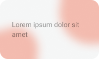
Incorrect
Avoid using full opacity for text on top of complex backgrounds, as it can make the text hard to read.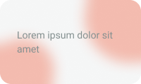
Takeaways
- The more complex the background ( example: an image ), the higher the opacity of the layer behind the text should be for text to remain readable.
Usage
Implementation
Properties
Opacity
default
Opacity:
1
Opacity:
0.9
Opacity:
0.7
Opacity:
0.6
Opacity:
0.4
Opacity:
0.3